
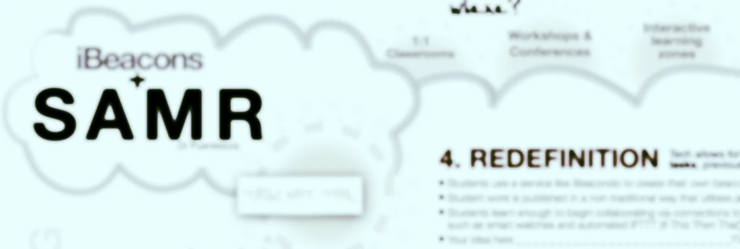

6 months in the making, this infographic aims to map the emerging uses of iBeacons in Education against the levels of the SAMR model developed by Dr Rubin Puentedura. Why? When a new technology emerges, its early uses in education will generally follow a path that begins at a substitution level of using the new tech almost exclusively just to replace something we could already do. In the case of iBeacons, this can mean pushing links to lesson resources out to class iPads rather than emailing them.
As our experience grows however, the challenge in regards to getting the most out of the time, money and energy spent on on deploying the new technology is to learn how the capabilities it brings allows us to augment, modify and then redefine the original learning task in ways that would never have been possible before.
I hope you find this chart useful - it is a just a version one, but has resulted from a large range of conversations I've had with leading educators and iBeacon early-adopters this year. Enjoy, share, and let's know ideas for a future version 2 :)
Download PDF version HERE.